


Logos aren’t just symbols. They carry stories, ideas, and histories—sometimes in ways that aren’t immediately obvious. If our logo feels familiar, that’s because it was inspired by one of the most recognizable marks in Canadian design: the CN Rail logo. Designed by Allan Fleming in 1960, it was more than just a railway emblem. It was part of a shift in how Canada presented itself to the world—one that embraced simplicity, modernity, and a sense of movement.
The 1960s were a turning point for Canadian design. Across architecture, graphic identity, industrial design, and infrastructure, a new era of modernism was emerging—one that emphasized clean lines, functional forms, and a rejection of excess. It was a time when Canada was defining itself visually, not just at home but on the world stage.


Habitat 67, Montreal 1967 & Catton House, Vancouver 1967
In architecture, modernist ideals were reshaping skylines and living spaces. Montreal’s Expo 67 became a global showcase for futuristic design, featuring Buckminster Fuller’s geodesic dome and Moshe Safdie’s Habitat 67, a modular housing experiment that pushed the boundaries of urban living. The Toronto-Dominion Centre, completed in 1967, introduced the sleek, International Style of Mies van der Rohe to Canada, while the National Arts Centre in Ottawa reflected the rise of Brutalism, a movement that valued raw concrete and bold geometric forms. Even residential projects embraced modernism—Catton House (1967), designed by Arthur Erickson and Geoffrey Massey in West Vancouver, demonstrated how architecture could be seamlessly integrated into its natural surroundings.

National Film Board Logo, 1968-2002 & Air Canada Logo, 1965-1987
But this design revolution wasn’t limited to buildings. The same modernist principles were influencing graphic design. The federal government launched a national design program to create cohesive, streamlined branding for government agencies, leading to some of the most recognizable logos in Canadian history. The National Film Board adopted its bold "man-seeing" logo in the 1960s, a minimal yet evocative design that symbolized storytelling through a Canadian lens. At the same time, Air Canada rebranded with a sleek, modern wordmark, abandoning its traditional serif type for a simpler, more international look.


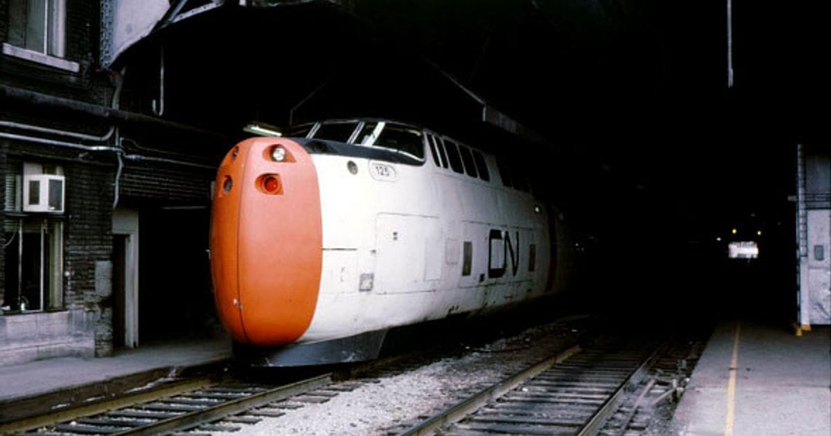
VIA Rail's LRC train & Canadair CL-215, (Aerial Firefighter)
Industrial design was also evolving. Transportation and infrastructure projects were being reimagined with the same clarity of form seen in architecture. Canadair (now part of Bombardier) was at the forefront of aerodynamic and efficient aircraft designs, including the CL-215 water bomber, which reflected the era’s emphasis on function-driven aesthetics. In rail transport, VIA Rail’s LRC (Light, Rapid, Comfortable) trains, developed in the late 1970s, applied modernist design principles to high-speed rail travel. With their sleek, aerodynamic locomotives and active-tilt technology, the LRC trains were built to navigate existing rail infrastructure more efficiently, reducing travel times without requiring major track modifications. Their design was a direct response to the need for speed, efficiency, and comfort, aligning with the broader push for streamlined, purposeful design in Canada at the time.
Across all disciplines, Canadian design was moving in the same direction—toward clarity, function, and timelessness. The CN Rail logo, created in 1960, wasn’t an isolated example; it was part of this larger movement, a reflection of how design was evolving across the country.
In the midst of this transformation, Allan Fleming was asked to redesign the Canadian National Railway logo. Instead of relying on traditional serif type or literal train imagery, he created something radical: a single, unbroken line forming the letters "CN" in one continuous stroke. It was sleek, dynamic, and felt in motion—perfectly aligned with the forward-looking design movement shaping the country at the time.
Fleming’s approach wasn’t just about aesthetics. He believed in design that lasted, that worked across generations without feeling outdated. The CN logo wasn’t about chasing trends—it was about distilling something down to its purest, most essential form. More than sixty years later, it remains untouched.

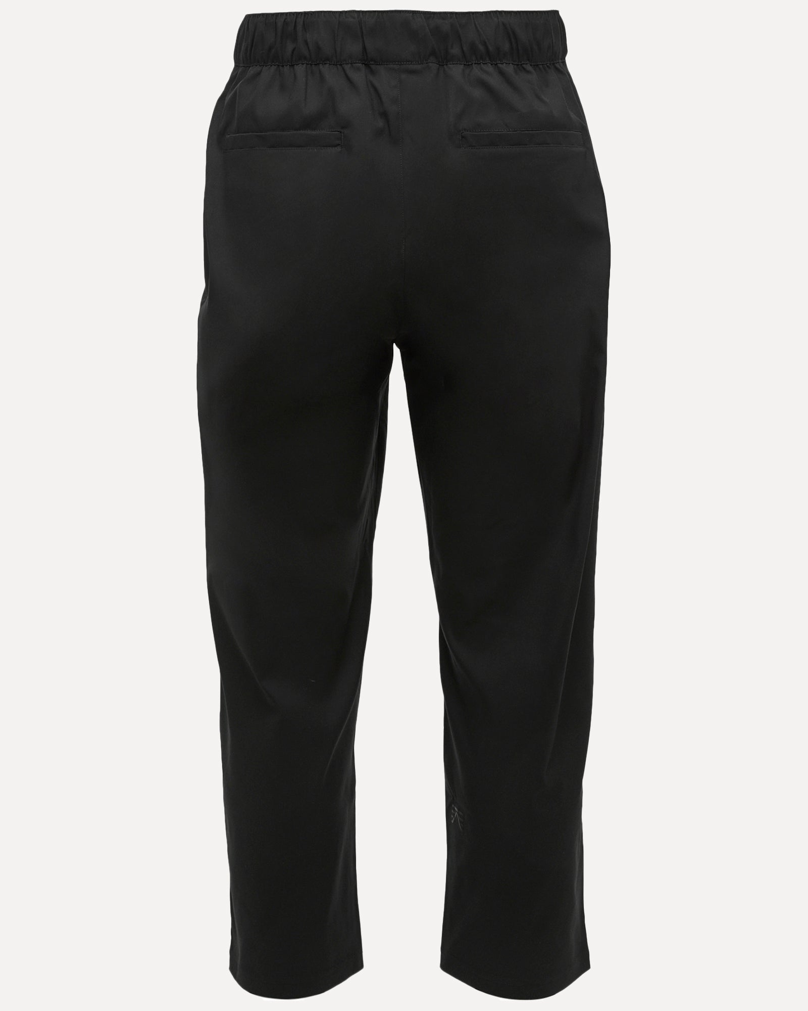
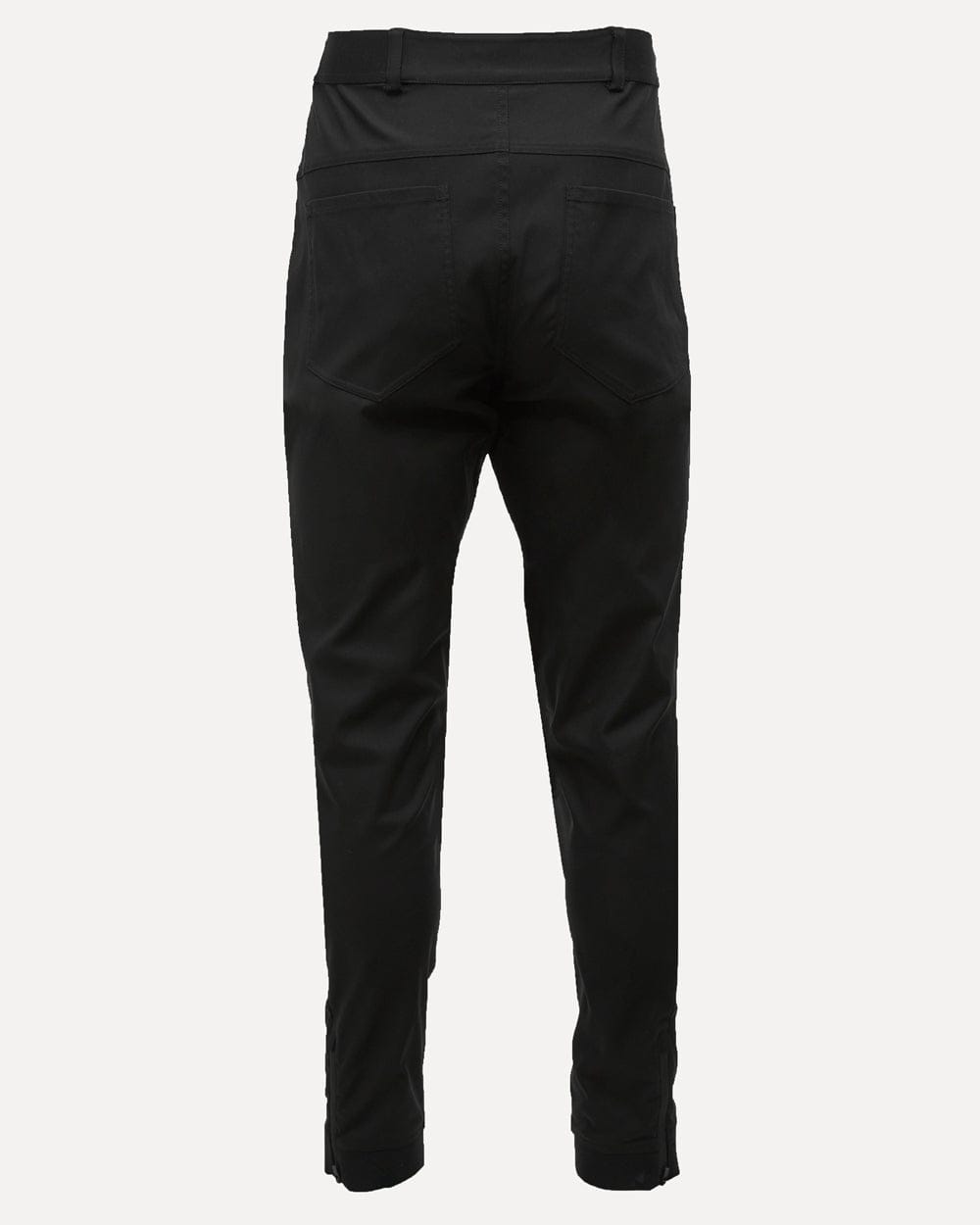
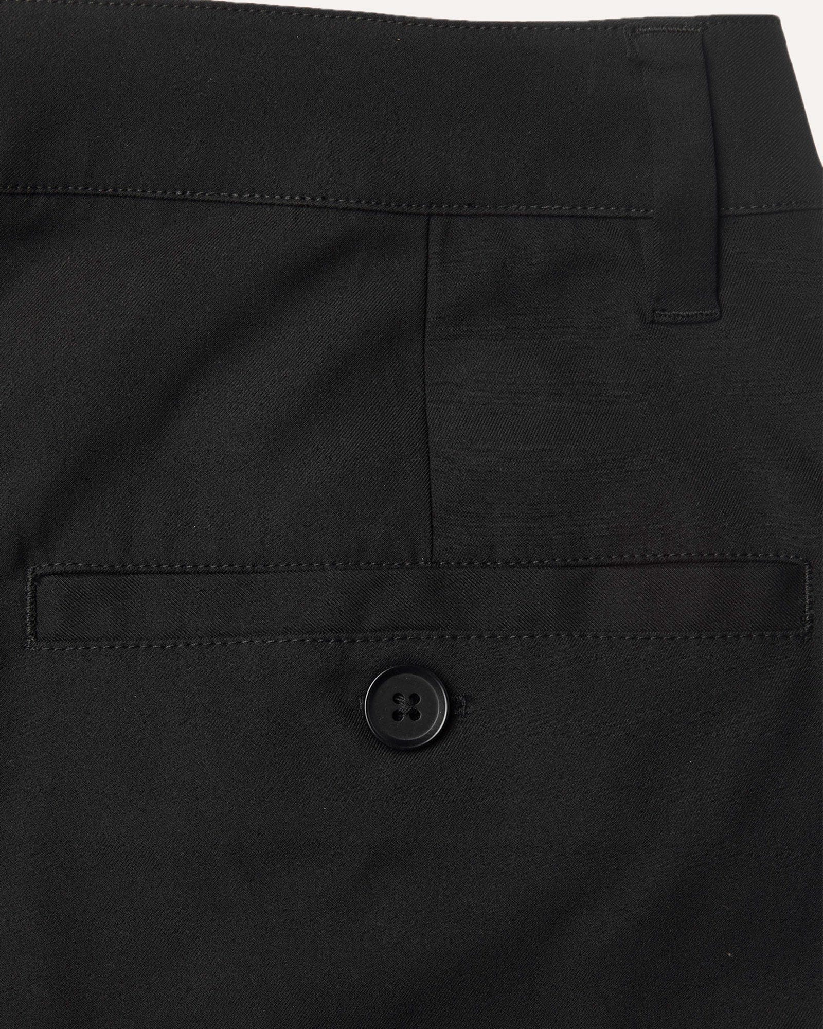
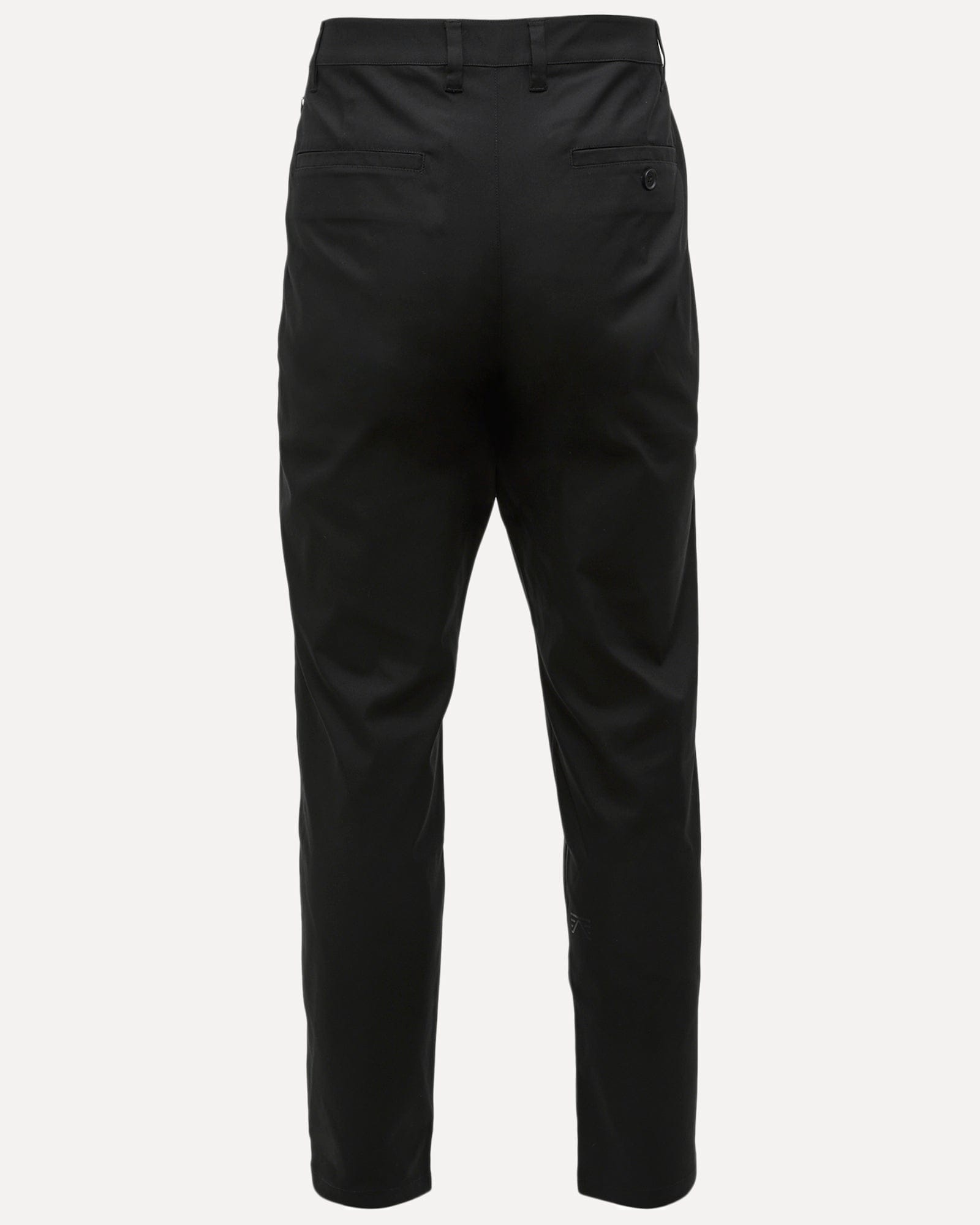
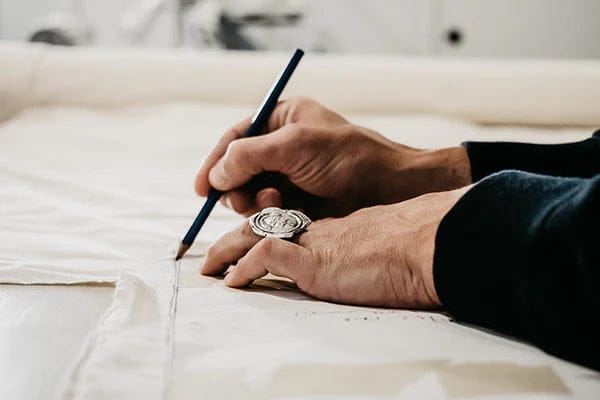
We wanted something with that same sense of clarity. A mark that, like the best Canadian design of the 1960s, was functional, adaptable, and built to last. That same thinking carries into how we design apparel—stripping away the unnecessary, refining the essential, and making pieces that work across environments and years, not just seasons.
Canada’s mid-century design movement wasn’t about following trends. It was about solving problems with elegance and efficiency. That’s an approach we take in everything we do—whether it’s the gear we make or the way we present ourselves.
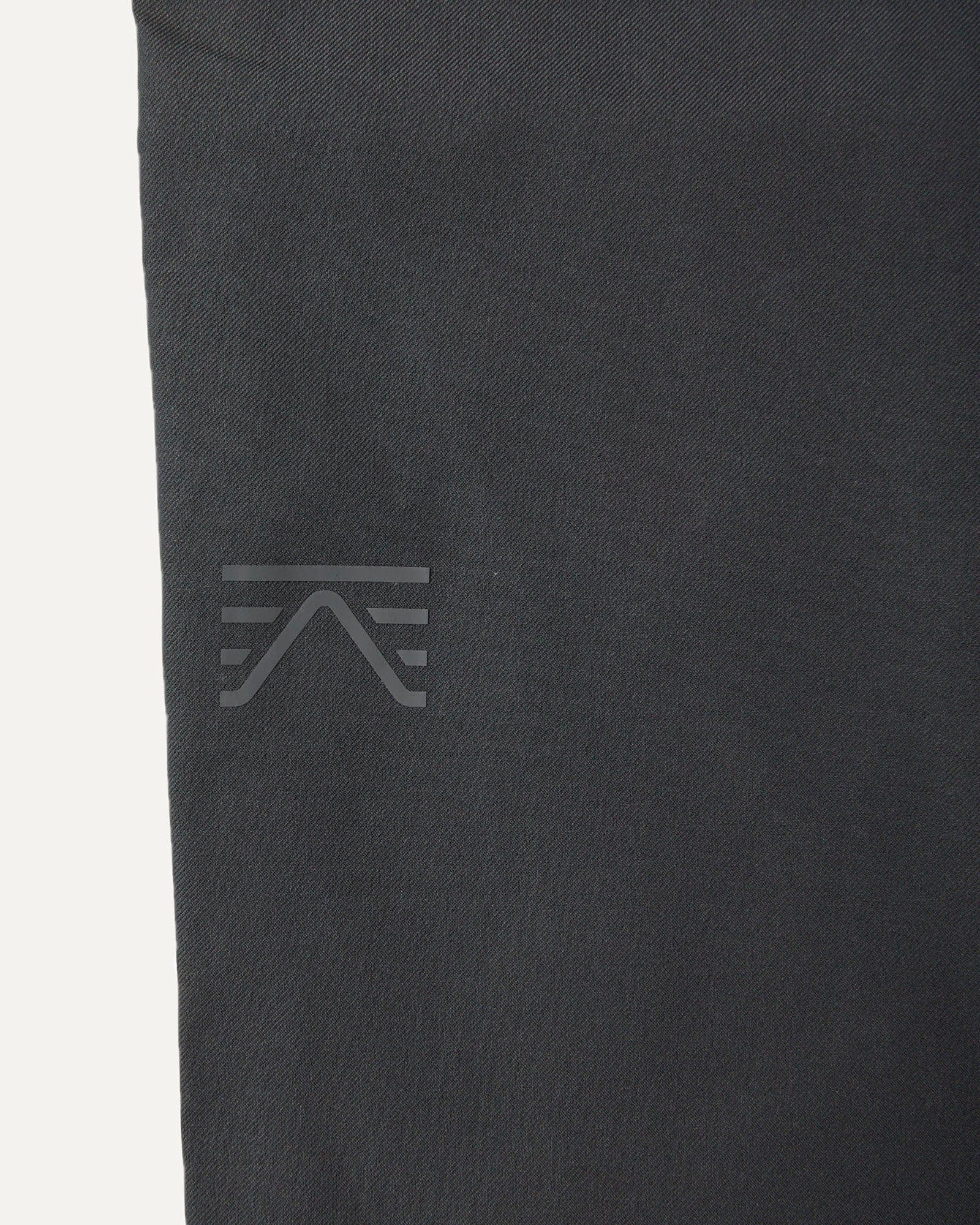
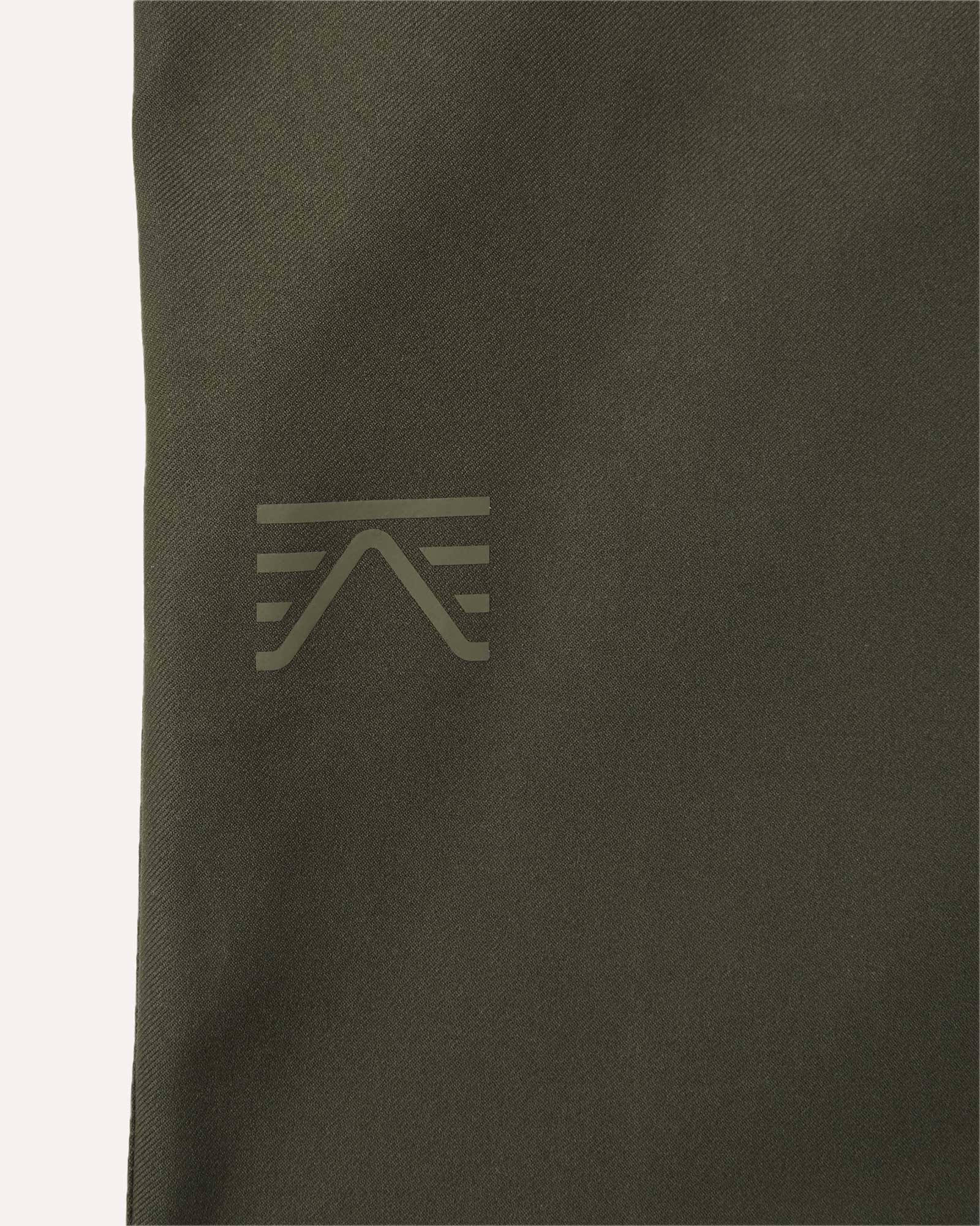
Our logo is a small part of that story. One detail in a bigger picture. But like everything else we design, it’s built with intention.